


My first branding project out of college, which turned into a 2-year job (and counting)
Client
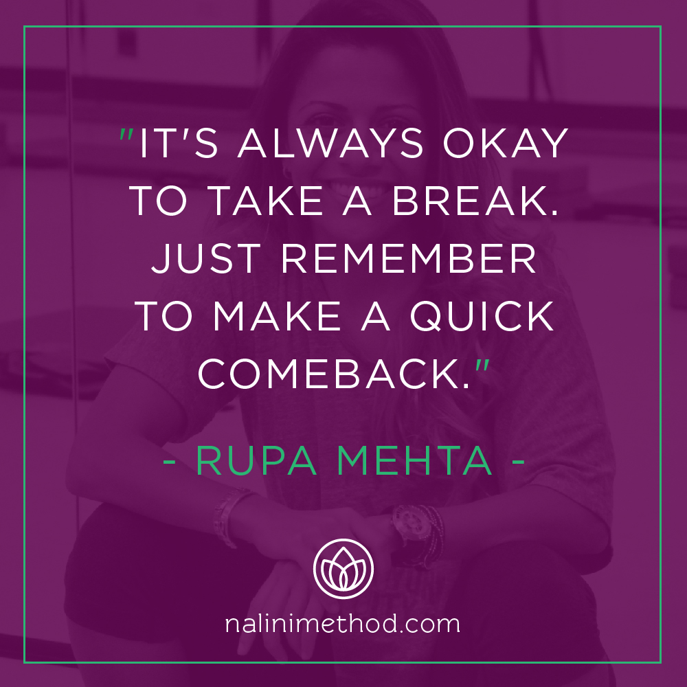
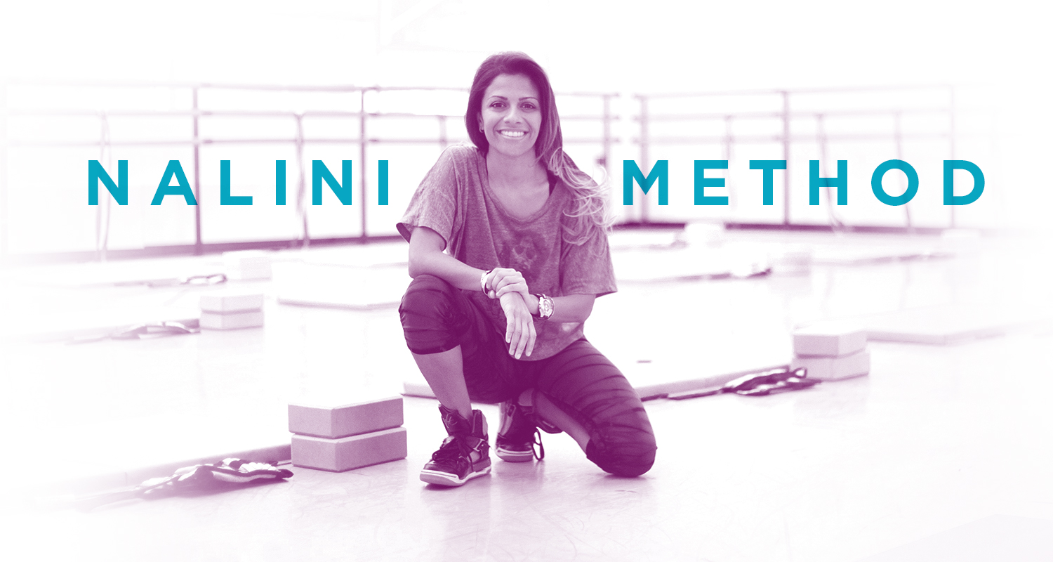
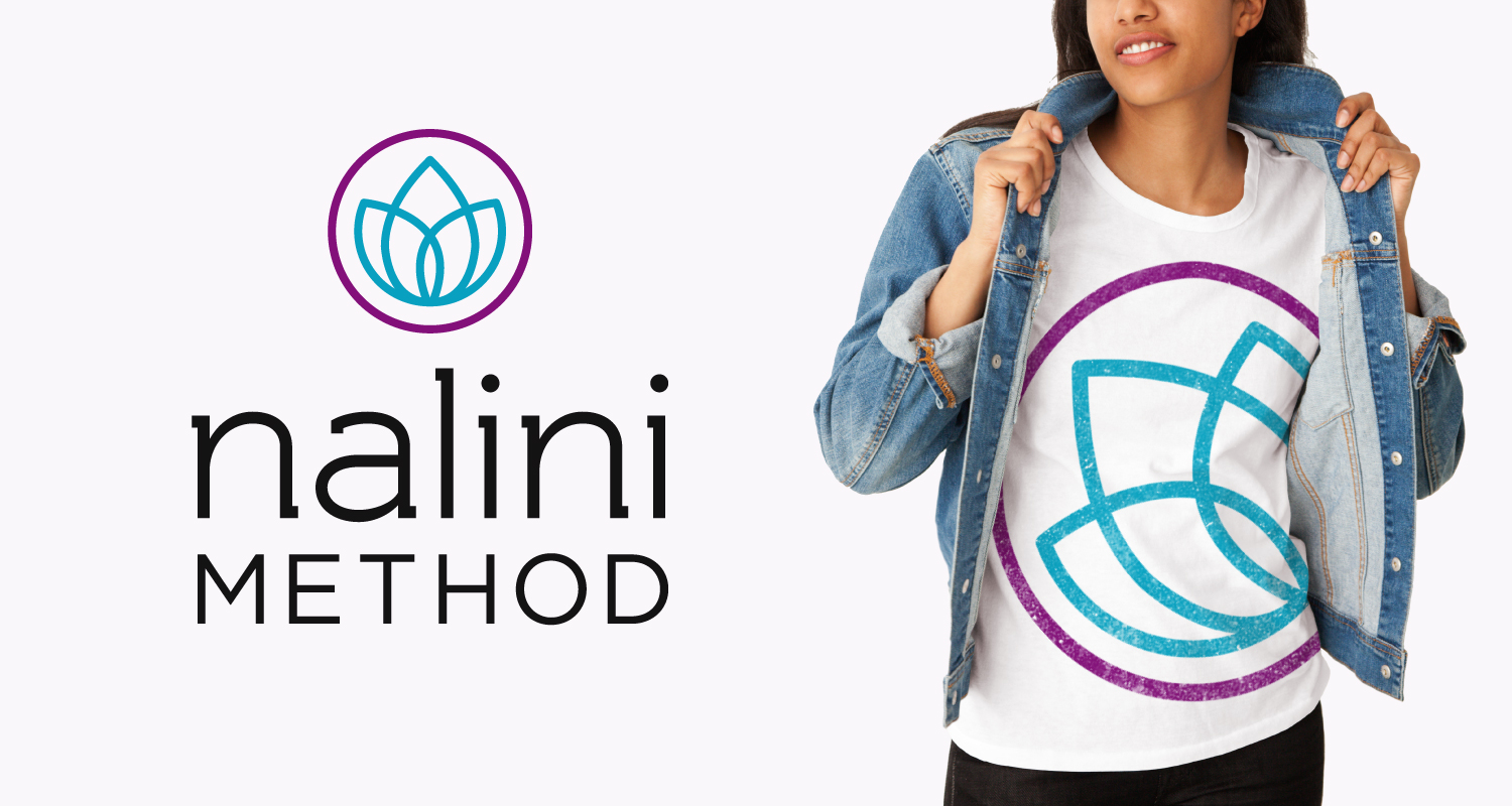
Nalini Method
Project
Branding & Website Design
Creative Team
Garet Camella, Nidhi Thapar, Jason Roth
Nalini Method Rebrand
Nalini Method is a fitness-meets-wellness company based in New York City. In 2014, founder Rupa Mehta recognized the need for a rebrand and an update to the Nalini Method online presence. The new brand direction also influenced two additional Nalini projects: NaliniKIDS (the nonprofit sector) and Rupa's own media-facing content.
Previous Nalini Method Logomark
Rebranded Nalini Method Logomark
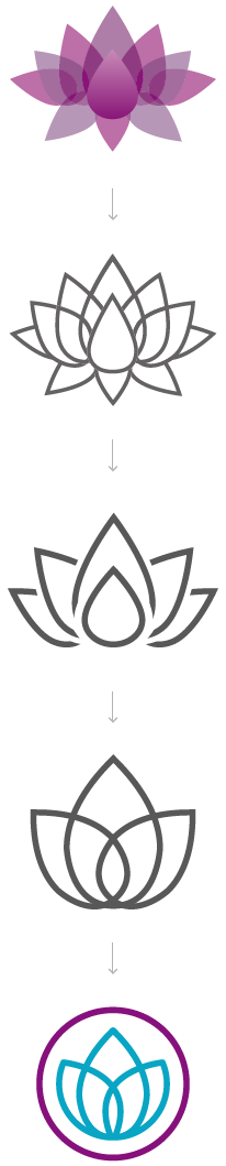
Logo Concept
Nalini is the Hindu word for lotus. It is also the name of founder Rupa Mehta’s mother, Nalini Pinak Mehta.
“The lotus flower starts small, growing from the bottom of a pond, pushing through mud and muck. As it slowly rises towards the light above the water, the lotus remains unsoiled. Only when it reaches the surface does the lotus bud begin to blossom and turn into a beautiful flower.”
Naming her business the Nalini Method was a no-brainer for Rupa; not only did it honor the journey of the lotus flower, but it was named after one of the healthiest, most-nurturing people she knew. To keep this concept intact was clearly important for her new logo.
Nalini Method was already represented by a lotus logomark, but the previous brand/logo unfortunately depended on gradient layering that didn’t translate very well in every application Rupa needed it to. After several rounds of sketching, we landed on a simple, monoline lotus flower mark.
Three Unified
Sub-Brands
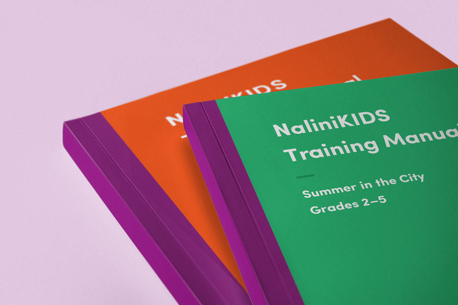
One of the most important requirements for the new brand mark was for it to encompass and account for all three sub-brands of the Nalini umbrella, including Nalini Method (the founding company), NaliniKIDS (its nonprofit sector), and the media-facing Rupa Mehta personal brand.
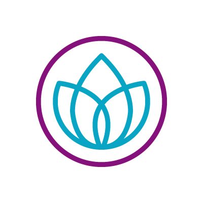
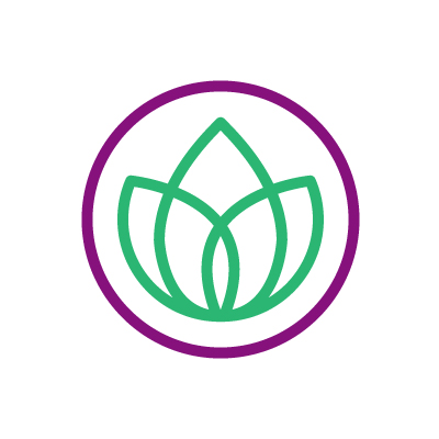
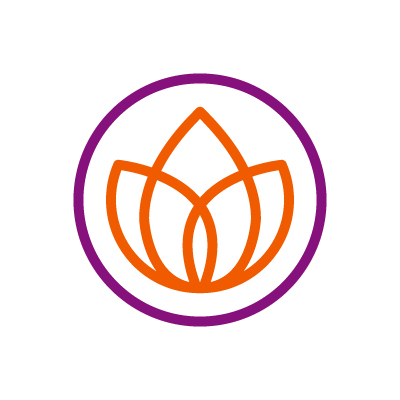
In layman's terms, the Nalini mark is quite literally a lotus flower inside of a circle. The lotus flower changes color depending on which Nalini sub-brand it represents, and a unifying purple ring stays constant on all three. For Nalini Method and NaliniKIDS, each brand is also represented by supporting logo type.
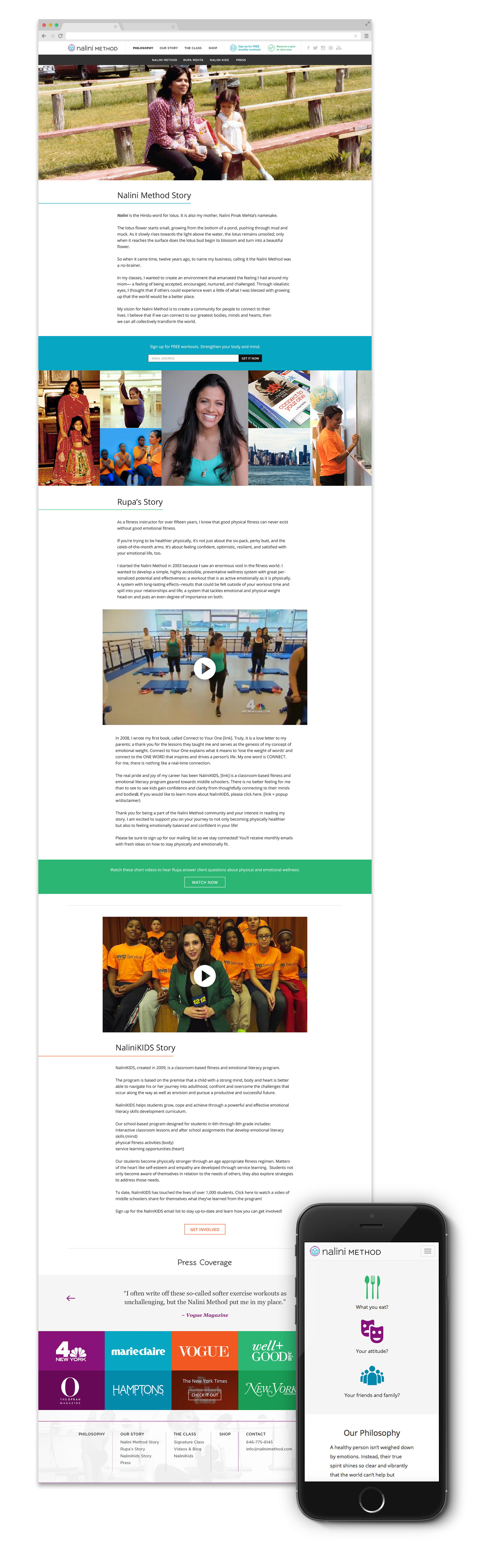
Nalini Method Website
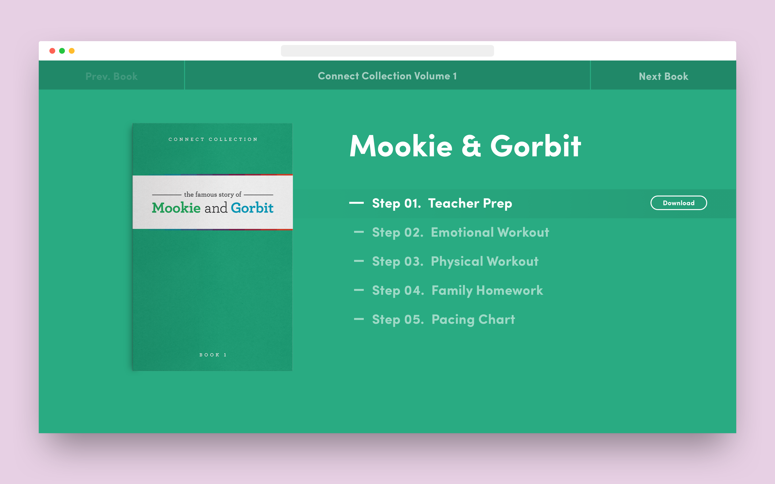
Once a new branding direction was in place for Nalini Method, our next project was getting the company's website up to date. Rupa needed a responsive site with a completely new content structure, one that would throw much more focus on imagery, videos, and blog posts.
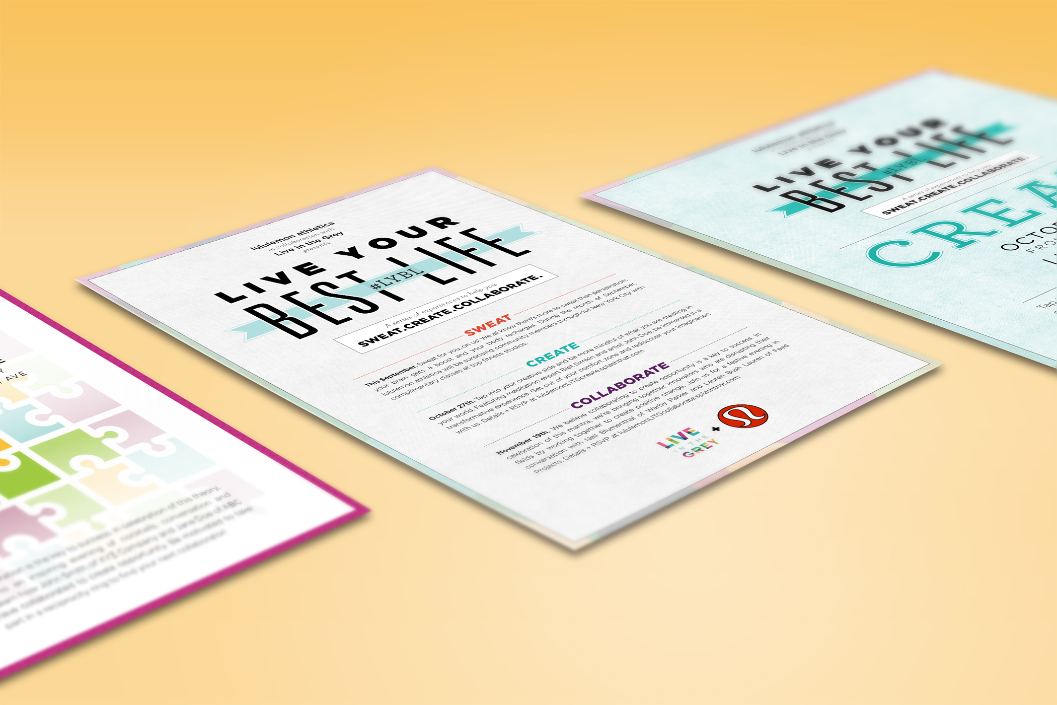
Additional
Brand Assets
With a re-established brand and online presence, the Nalini Method has a foundation to constantly build upon. The company's reach goes far beyond its website and style guidelines book; external-facing digital and print assets are constantly shaping the Nalini Method brand.