
Beyond client testimonials — Helping a career coach shed light on his own strengths.
Client
John Sanchez — Executive Coach
Project
Website Design & Personal Branding
Creative Team
Garet Camella, Nidhi Thapar, Matthew Kennedy, Colton Williams
Discovery & Strategy
Though the term “businessman” is pretty dated and arbitrary these days, John Sanchez is indeed a business man. At the start of our work together, his branding echoed that all-too-familiar, loosely defined “professional” aesthetic. You know, the sort of website that canned stock photography is made for. Like a LinkedIn profile, it presented information about John, but didn’t come close to matching the feeling of sitting down with John himself. It was time for a change.
The Situation
John is an executive coach; a passionate career advisor who helps established men and women to thrive in new roles, navigate organizational challenges, and build confidence in their growing skillsets. John prides himself on helping clients and others in his life reach higher than they deem possible; challenging them to be more and think differently.
Ironically, our work together required John to swallow his own medicine and do something he helps many of his clients do — get out of his own way. We needed to rebuild John’s brand from the foundation up.

Homework & Moodboards
It started with a Google Doc full of questions. John was assigned branding homework to give our creative team (and John, himself) insight into his own values, preferences, unique attributes, and aspirations. From our discovery session with John, we paved way for both content direction and aesthetic direction.
We synthesized his responses into three unique mood boards, which spanned an aesthetic spectrum from natural & bright to refined & mono-chromatic, from minimal & elegant to masculine & sleek. Discussing each aesthetic direction gave way to a clearer picture of John’s new identity; it helped determine photography direction, color palette, and type + text treatment.
John’s chosen key words:
Clean, Honest, Natural, Smart, Modern, Straightforward
Laying the Foundation
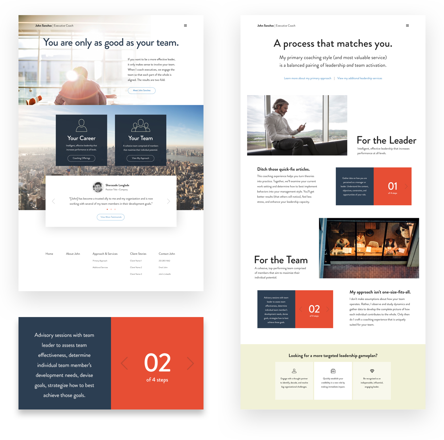
We quickly realized the crucial difference between a corporate brand identity and a succesfful personal identity. John’s clients want to work with John, not a “company”. Because of this, a sleek logomark for John’s services seemed low on the design priority list.
Instead, we decided to focus on foundational brand assets that we would also use for John’s website: A decisive photographic style. A refreshing, more upbeat color palette. Consistent tone of voice in copywriting. And consistent illustrative elements.

Color Palette
We chose strong, bold colors to exhibit confidence and strength. Including a warm secondary neutral hue also helped to balance this out.

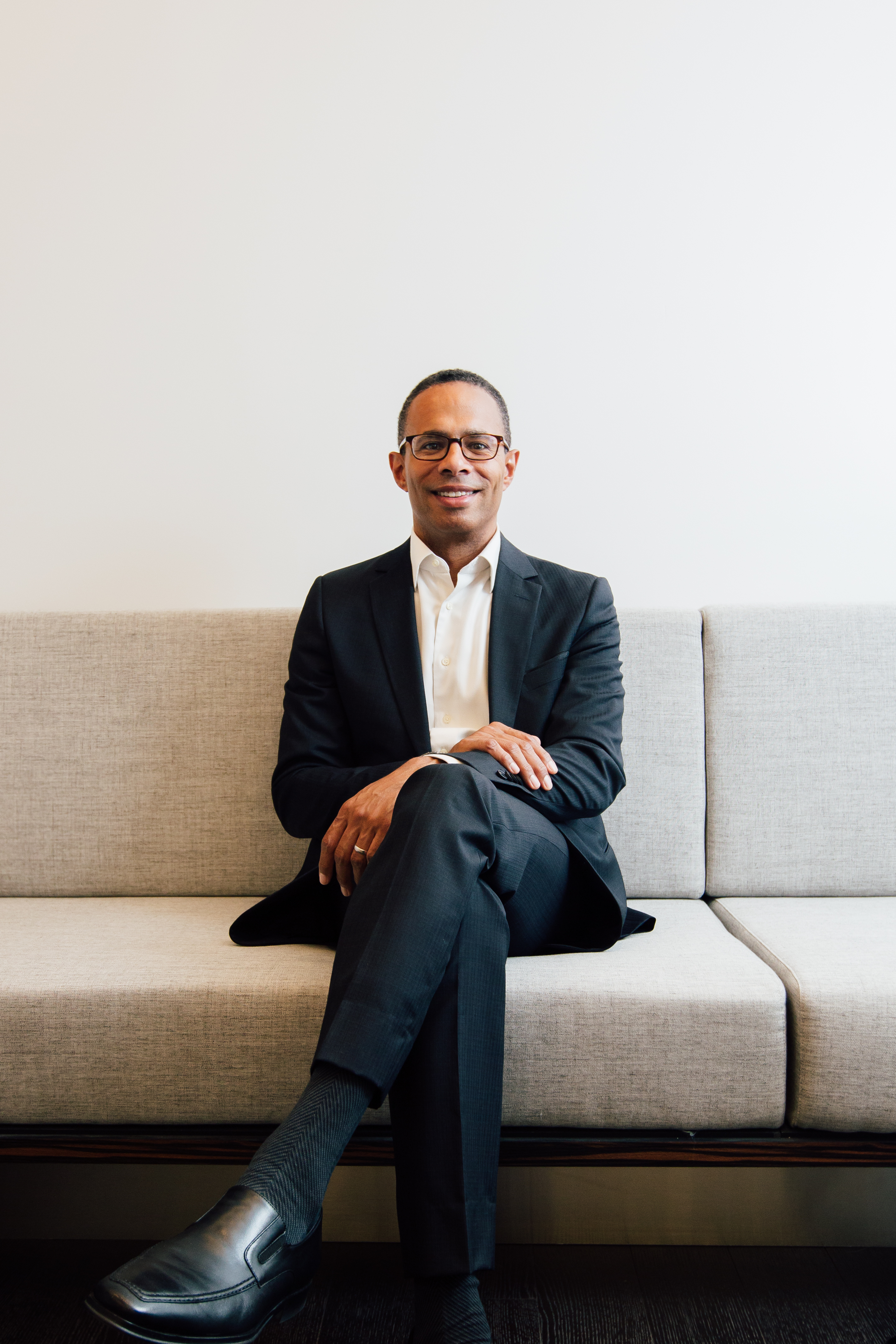
Photography
Updating photography was a crucial aspect of John’s new brand. We sought a more candid, honest, and natural direction, helping site content to feel more approachable.
Iconography
To keep things clean and straight-forward, we expanded upon a kit of monoline icons with a thin, yet sturdy feel.
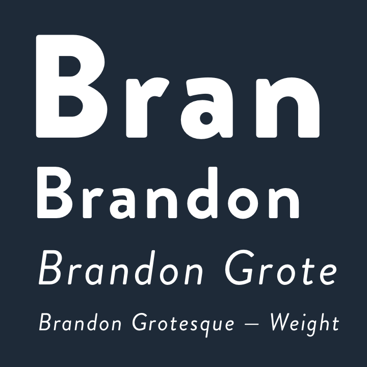
Type + Text
Utilizing Brandon Grotesque was a fun type/text decision. The typeface plays well in all weights, allowing for a modern feel with unique character.
Creating Valuable Content
Any business owner with a website can create the impression that their services are “Fantastic! 5 Stars!” — but not everyone has the proof to back up their clients’ claims. We decided to promote John’s services like any smart designer would — with thorough case studies. Our team interviewed John’s clients and coupled their responses with editorial portraiture, creating a thorough representation of John’s successful process and positive client relationships.